
Prussian Blue has an interesting background. From dyeing the Prussian army uniform to starring in many iconic works of art from Hokusais’ Great Wave to Picassos’ Blue Period.
Prussian Blue has always been a much loved colour in my palette. Surprisingly to me, the reactions from some watercolour painters did not share this love. “Oh! It’s very staining”, “that’s a hard colour to work with” and even; “I wouldn’t give it the time of day!”
Intrigued by the controversy that Prussian Blue evoked in some painters, we, as makers of watercolour paint, wanted to investigate further.
Here at Art Scribe we make watercolour paint using the traditional process of hand mulling. It’s a very hands-on approach to making paint and allows us to become more connected with the pigment. The pigment we use is finely ground, artist quality. In the case of Prussian Blue, the pigment is made by a process of chemical reactions through oxidation and is intensely coloured.
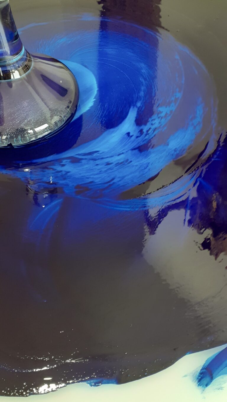
Reg set about mulling our first batch of Prussian blue watercolour paint. The pigment of darkest blue was spooned onto the glass mulling slab. It absorbed the binder easily, first becoming a blue-black paste before slowly becoming more paint like in its consistency as more liquid binder was added.
I became mesmerised as Reg moved the blue pigment across the slab in increasing circular movements with the hand-held muller. Like a black and magical mirror, the depth of the colour reflected back the room and ourselves, while streaks of brilliant electric blue shone through.
What we saw on the slab would be hint of the range of tones we would discover when applying the paint on paper.
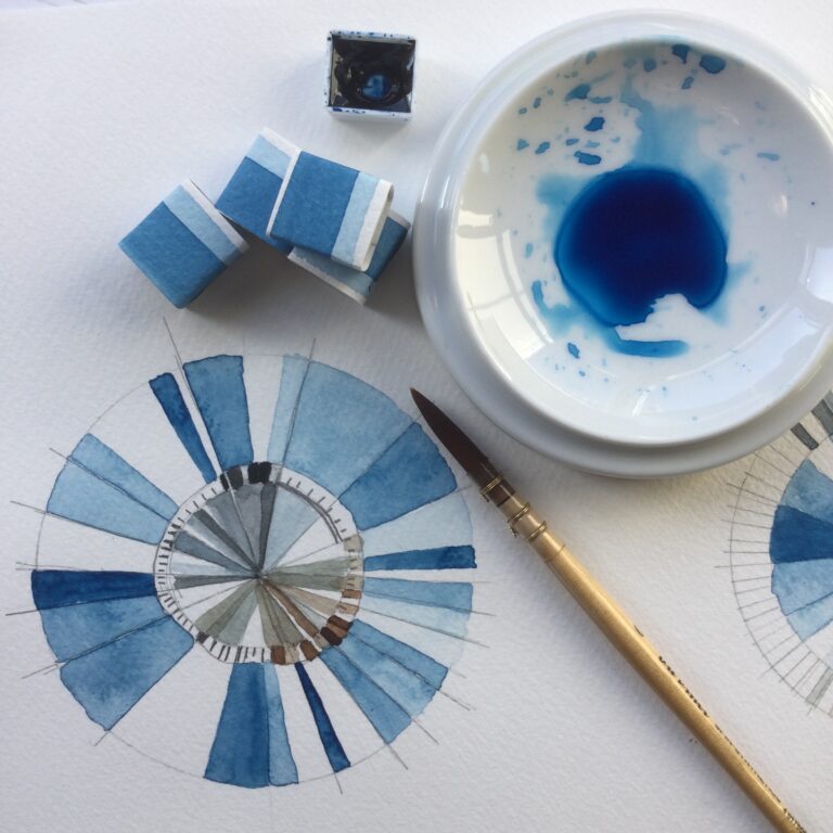
We then looked at how our Art Scribe Prussian Blue watercolour performed on paper. Its tonal range, granulation, transparency and wet-on-wet.
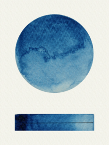
In terms of its tonal qualities, Prussian ranges from a dark and intense midnight blue to a soft pale baby-blue when diluted. Its mid tones are reminiscent of a denim blue.
Granulation is moderate.
Transparency is evident in its lighter tones. But Prussian will not completely lift off the paper making it a staining colour.
When it came to experimenting with Prussian I used a cold pressed, moderately textured paper.
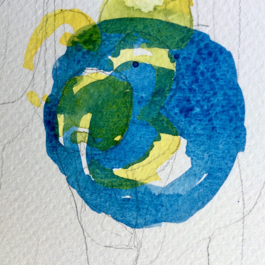
My initial instinct was to work it with minimal dilution over yellows allowing them to pop through the blue and give contrast. The transparency of the blue created some rich greens, even over the more subtle yellows.
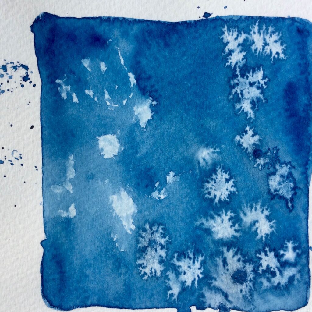
I threw salt crystals upon the wet surface in order for abstract stars to appear. Blooms appeared with Prussians staining quality and tonal ranges coming into play.
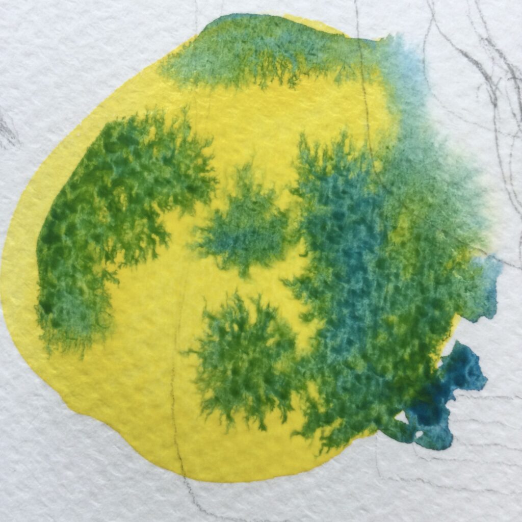
Working wet on wet, I dropping Prussian Blue into pools of Hansa Yellow to watch it creep and blend organically into seaweed like teals.
Transparency creates overlaid colour mixes.
Staining qualities with salt crystals.
Organic colour mixing with wet on wet.
Once the expressive experimentation was out of my system, I explored some more deliberate and formal colour mixing. The results were beautifully subtle and delightfully surprising.
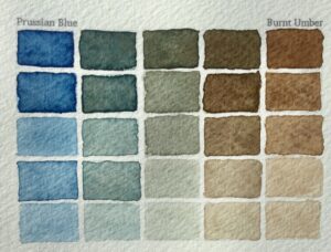
Prussian & Burnt Umber: Teals, greys and earthy browns.
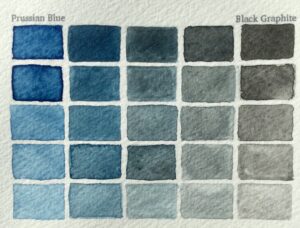
Prussian and Graphite Black: greys and blues for the shadows and stormy skies.
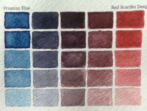
Prussian and Scarlet Deep: deep purples.
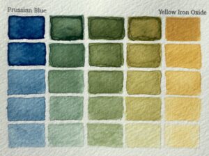
Prussian and Yellow Iron Oxide: earthy greens.
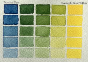
Prussian and Hansa Brilliant Yellow: vibrant greens.
How to read the colour charts above:
Prussian Blue is a powerful colour. It has diversity in its tone and mixing ability. The fact that it is staining means it leaves a subtle water mark of itself which only adds to its tonal range.
The other thing to be aware of is how it can quickly dominate a palette and colour mixes. Therefore, care should be taken when used in colour mixes. I suggest adding Prussian gradually to a colour you are mixing with.
When mixed with yellows and greens, you have a vast range for painting foliage.
Skies and seascapes become atmospheric with interesting granulation when mixed with Graphite Black or Burnt Umber.
For the deepest darks and blacks you can’t go wrong with Prussian in the mix.
Prussian Blue will continue to be a favourite in my palette and I recommend exploring its qualities if you haven’t already. Finally, I invite the skeptics to give it another go and embrace the power of this midnight hue.