
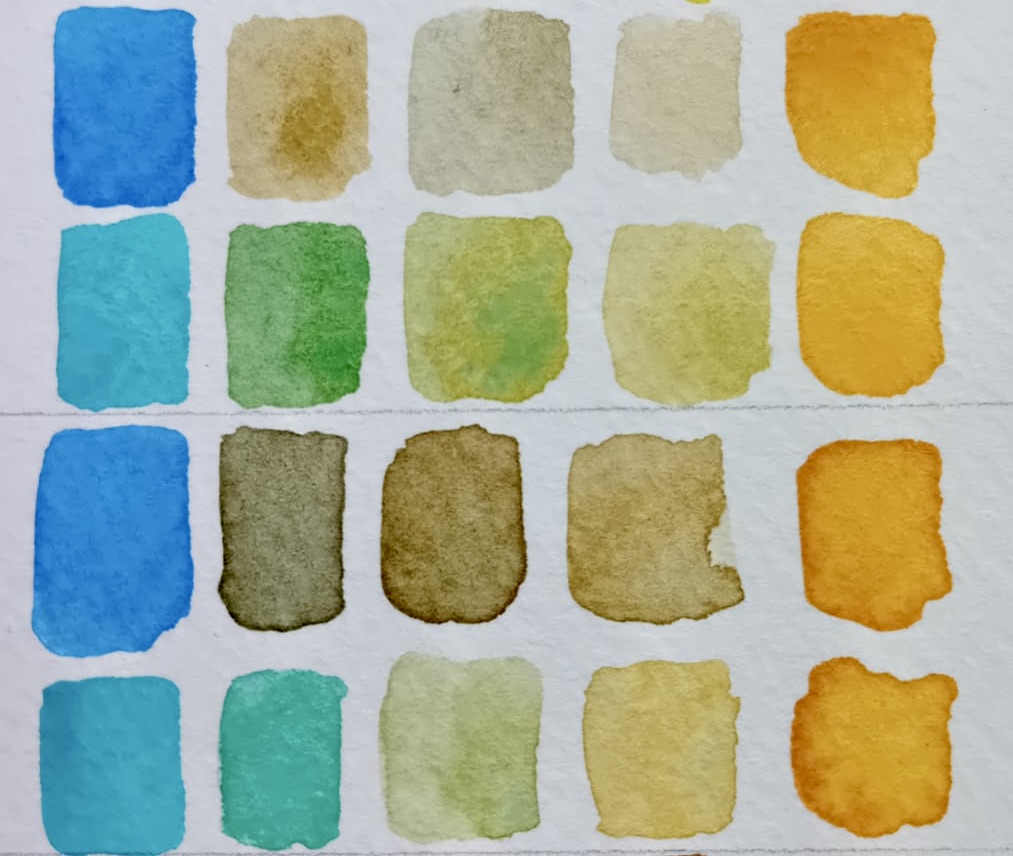

Here we investigate watercolour mixing with Cobalt Blue Medium and Cobalt Turquoise with specifically, a range of yellow shades.
Now just because we’re using blue and yellow in the mix, this doesn’t always mean you’ll get a green result. This is because it depends on the tonal quality of the two colours used in the mixture.
So in this study you’re going to see some useful greys, browns and purples as well as some natural greens and more vibrant greens.
Let’s start by introducing the two blues: Cobalt Blue Medium PB28 and Cobalt Turquoise PB50. Both from the Art Scribe handmade watercolour range and each one quite different in tone and warmth. So, when watercolour mixing with Cobalt Medium, I expect to see different results to mixing with Cobalt Turquoise.
The History & Science:
The colour Cobalt Blue is an artificial mineral pigment created from cobalt oxide and aluminium oxide and was first created by Louis Jacques Thenard in the early 1800’s. Because of its stability and lightfastness, Cobalt became a go-to blue in the painters palette.
By adjusting the quantities of the compound and adding other metals, a spectrum of coloured cobalt pigments can be made. Examples of which are: Cobalt Green, Cobalt Violet, Cobalt Yellow and Cerulean Blue.
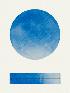
A bit of a Goldilocks, Cobalt Blue Medium is not too warm, not too cool. Not leaning towards a red, nor confusing itself with a green. So a good neutral blue.
When used in colour mixes, it’s good to remember its subtle power of muting and neutralising giving you naturalistic, soft tones.
Qualities of Cobalt Blue Medium:
Neutral blue which mutes colour mixtures.
Transparent.
Moderately granulating.
Excellent light-fastness. good lifting off the paper.
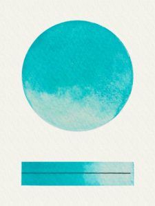
A bright and lively Cobalt which is cooler than the medium. In mixtures, the granulation will give you subtle effects of two-tone.
Qualities of Cobalt Turquoise:
Very brilliant and bright blue. Semi-transparent. Granulating. Medium tinting strength. Excellent light-fastness.
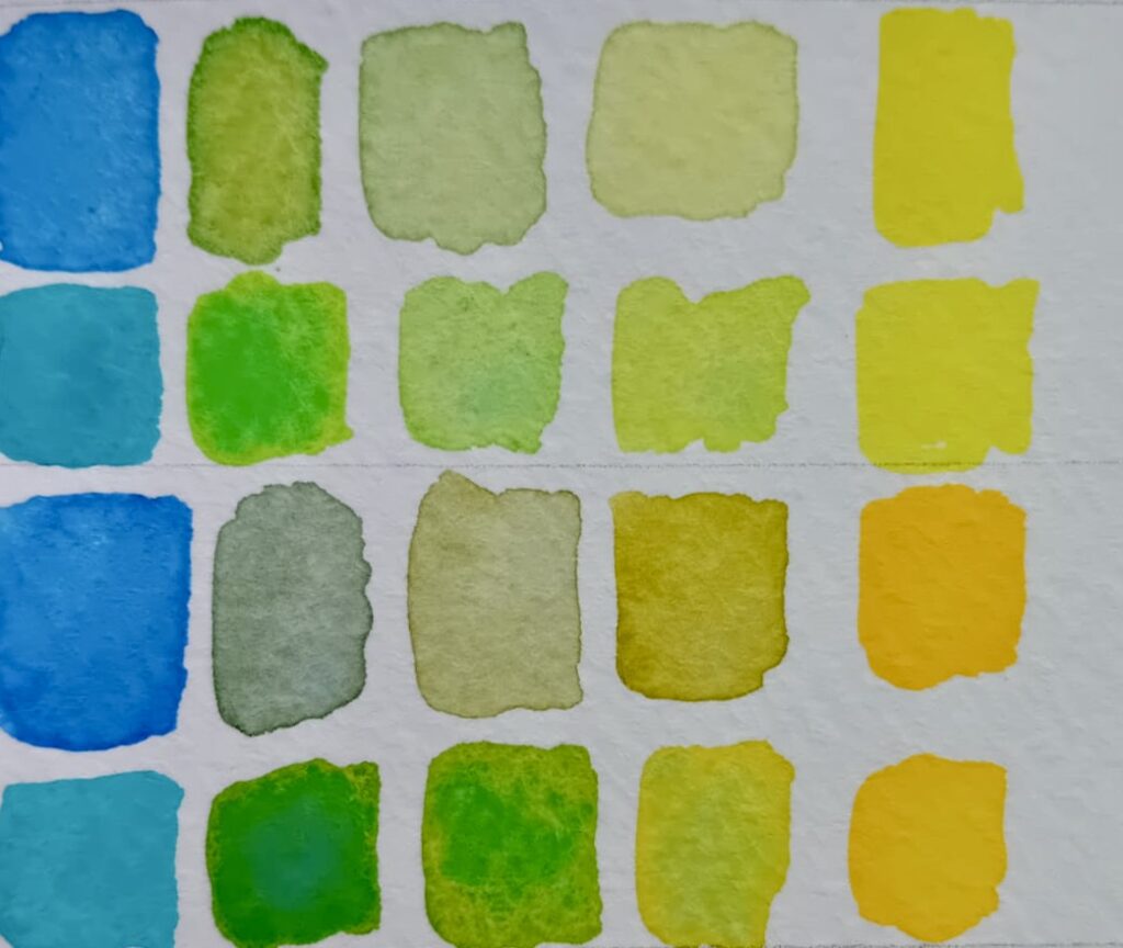
We have five yellows in our Art Scribe handmade watercolour range, and they each bring something different to the party.
Cadmium Yellow Lemon PY35. Semi-transparent. Strong tinting. Brings luminosity.
Hansa Yellow PY74. Transparent. High tinting. Warm, bright. yellow
Italian Gold Ochre PY43. Semi-transparent. Slight granulation. Gentle soft golden tones.
Yellow Iron Oxide PY42. Opaque. Moderately granulating. Strong earthy tones.
Cadmium Yellow Deep PY37. Semi-transparent. Strong tinting. Rich orange undertones.
Cobalt Medium + Cadmium Lemon= Fresh, spring greens.
Cobalt Turquoise + Cadmium Lemon= Vivid, bright greens. Close to Cadmium green.
Cobalt Medium + Hansa = Warm grey/teal to warm oak leaf green.
Cobalt Turquoise + Hansa= Rich emeralds to lively two-tone pops.
Cobalt Medium + Italian Gold Ochre= Buff to warm greys.
Cobalt Turquoise + Italian Gold Ochre = Ocean green to granulations of rock pool green-yellow.
Cobalt Medium + Yellow Iron Oxide = Natural, greys and browns.
Cobalt Turquoise + Yellow Iron Oxide = Vivid teal softening to natural greens and ochre.
Cobalt Medium + Cadmium Yellow Deep = Hazy purples to russet orange.
Cobalt Turquoise + Cadmium Yellow Deep = Olive greens to soft yellow-brown.
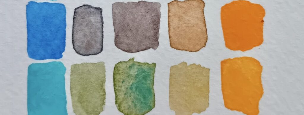
Cobalt Blue Medium will give you more natural and muted tones in colour mixtures. It’s colour range is also greater, giving us those natural warm greys, browns, purples and orange which can be used to depict shadow areas.
Cobalt Turquoise delivers fresher, brighter greens. Although the colour range it mixes is more limited, it does have that fantastic granulation that will add texture.