
This article explores the benefits of making a watercolour mixing chart, a step-by-step guide to how to create one plus a link to download your own chart template.
If you’ve seen any of our instagram posts or visited us at a craft fair, you’ll know that we love a colour mixing chart at Art Scribe! Not only are they beautiful things to look at, mixing charts are an excellent way of really getting to know the colours you’re working with.
When we are deciding on which colours to bring together for a set, we always start with a few quick colour mixing charts in the sketch book. Just grabbing a pencil and ruler and drawing up a miniature square in an A5 pad is enough to see what the colours can do and how much the colour range will increase.
We recommend doing a colour mixing chart when you buy a set of colours to explore how the pigments respond on paper and how colours mix and blend together. Colour charts are especially good when it comes to those tricky colour blends such as mixing greens, mixing darker greys and browns without the addition of black or exploring the diversity of colours that make of skin tones.
Once you have painted your mixing chart, use it as a reference to see what colours and tones can be made or as a source to inspire ideas.
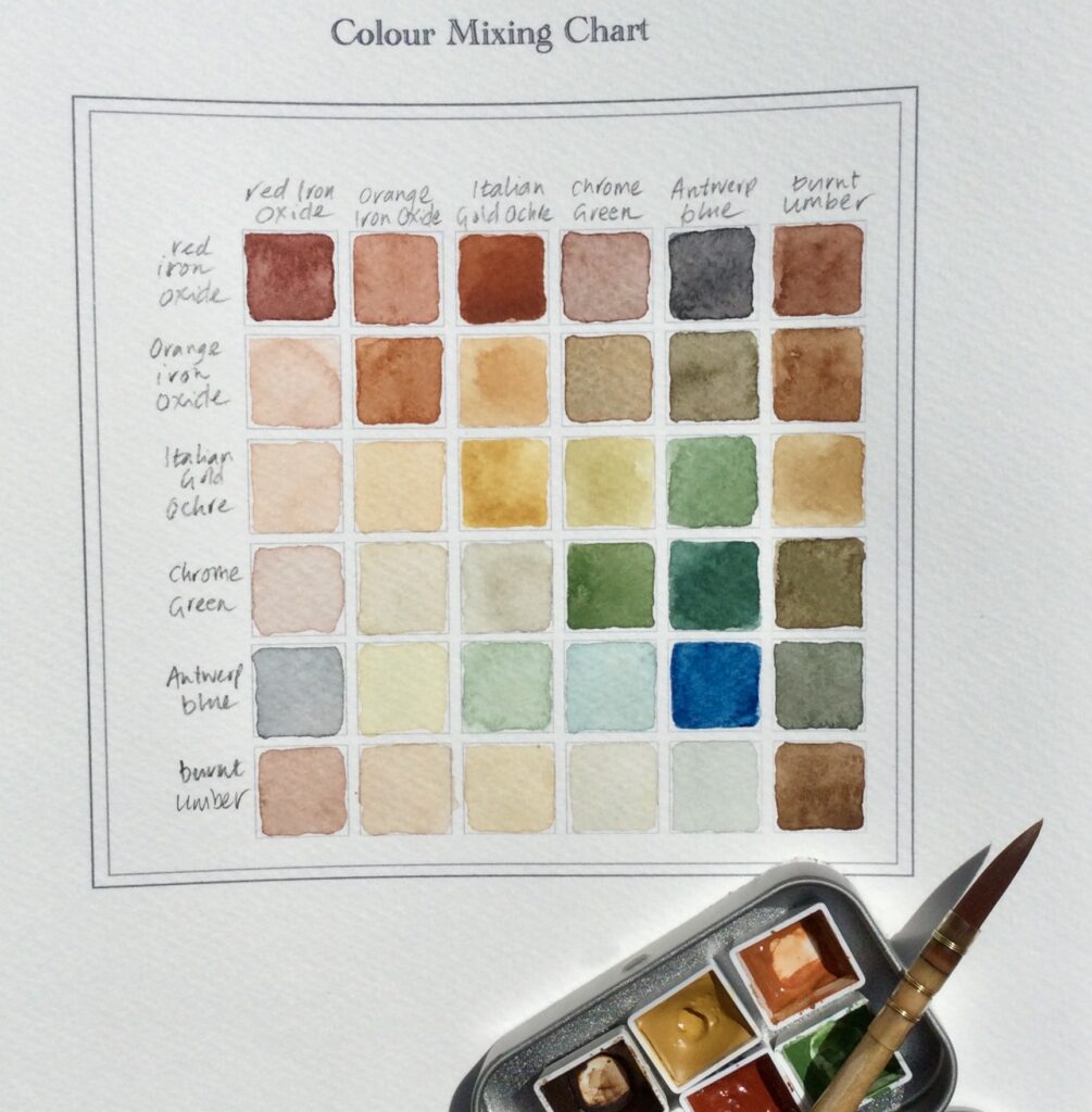
You may have noticed that there are lots of different ways to creating a mixing chart or colour wheel and we encourage you to get creative with it. In this step-by-step tutorial we are focusing on a traditional six colour chart within a square format.
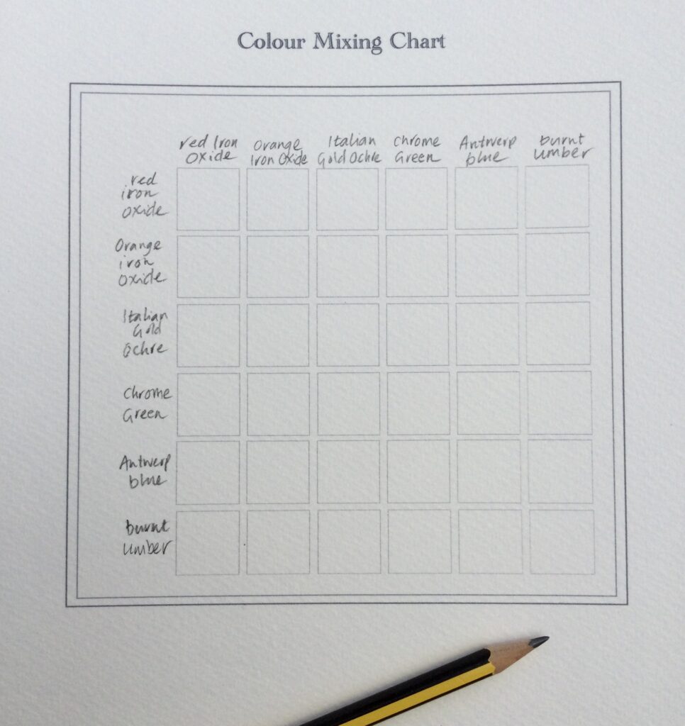
If you don’t want to measure out your chart, you can download our template so you can start mixing straight away! Try printing the template on a sheet of 200gsm watercolour paper.
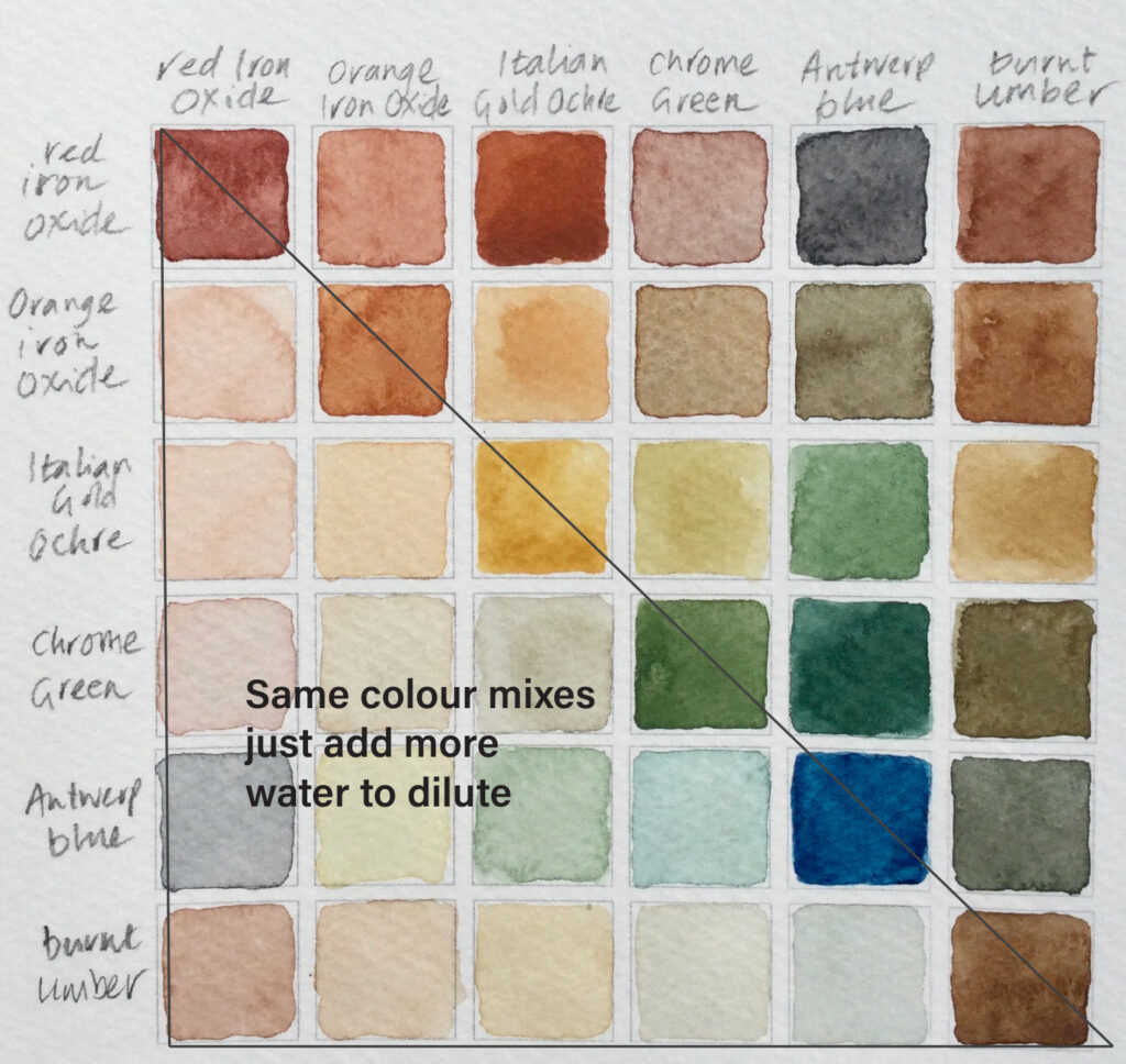
1. Start by measuring and drawing up a square which is divided equally into 36 squares.
Write the names of the colours you are using along the top and down the right hand side of your square. It is important to write the colours in the same order on both the top and side edges.
I like to place the colours in the order of a spectrum: reds, oranges, yellows, greens, blues, violets and end with darks such as browns or black. This gives an attractive colour gradient to the final chart.
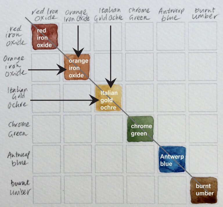
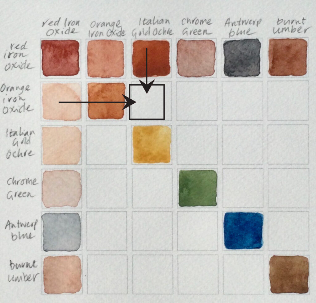
2. On the diagonal line, paint the colours from your palette un-mixed. At this stage I like to work the colour straight from the pan using just enough water dilution to see how the pigment responds on the paper in terms of granulation and opacity.
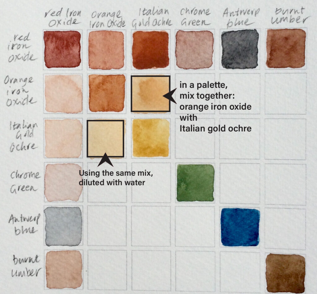
3. This is where the fun of colour mixing begins. To know which two colours to mix together, read the chart like map coordinates. Think of it as a game of Battle ships! take your finger down the latitude (north/south) line until it meets the colour on the longitude (east/west) line.
In the illustration, the next square to be filled will be mixing the colours Italian Gold Ochre (from the top row) and Orange Iron Oxide (from the left row).
4. You will see that the colours right of the diagonal is a mirror of the colours left of the diagonal. So you will be using exactly the same colour mixes twice. I like to put the darker, less diluted colours to the right of the diagonal and the diluted colours on the left. This will give you an idea of the tonal range the mixed colours have.
When it comes to colour charts, some people like to mix the two colours together as an equal ratio of 50:50. I tend to work more intuitively and mix the colours until I get a colour I like. This works especially well when it comes to those strong and opaque colours. In the case of my illustrated Earth palette, Chrome green and Antwerp blue are quite dominating colours so when mixing with the subtle colour of Italian Gold Ochre I will start with the ochre and gradually add a little of the stronger colour to achieve a colour I am happy with.
Have fun with your colour mixing chart and enjoy exploring and getting to know the colours in your paint box!
To download your free PDF Colour Mixing Chart click on the button below. Try printing on a sheet of 200gsm watercolour paper.
Art Scribe are makers of fine watercolour paint. We are based in Devon , UK.
Find out about our traditional paint making processes and the inspiration behind what we do HERE.